
Thursday 1 December 2011
Sunday 30 October 2011
Visual metaphors
We were asked to choose from the following phrases; Reaching retirement, Dreams of romance, Broken relationship, Censorship of the press, High achievement and Economic catastrophe, to produce an image of a visual metaphor.
We were also asked to collect some examples of images that depicted our choice. I decided to work on the phrase 'Broken relationship'.
I looked at many articles online, and chose a few of what I considered to be the best pictures used to illustrate the phrase.


We were also asked to collect some examples of images that depicted our choice. I decided to work on the phrase 'Broken relationship'.
I looked at many articles online, and chose a few of what I considered to be the best pictures used to illustrate the phrase.


It was suggested that we made a spidergram of words associated with the phrase. I found this quite difficult!
What stood out most to me was sense of two people being separated by something - an issue etc

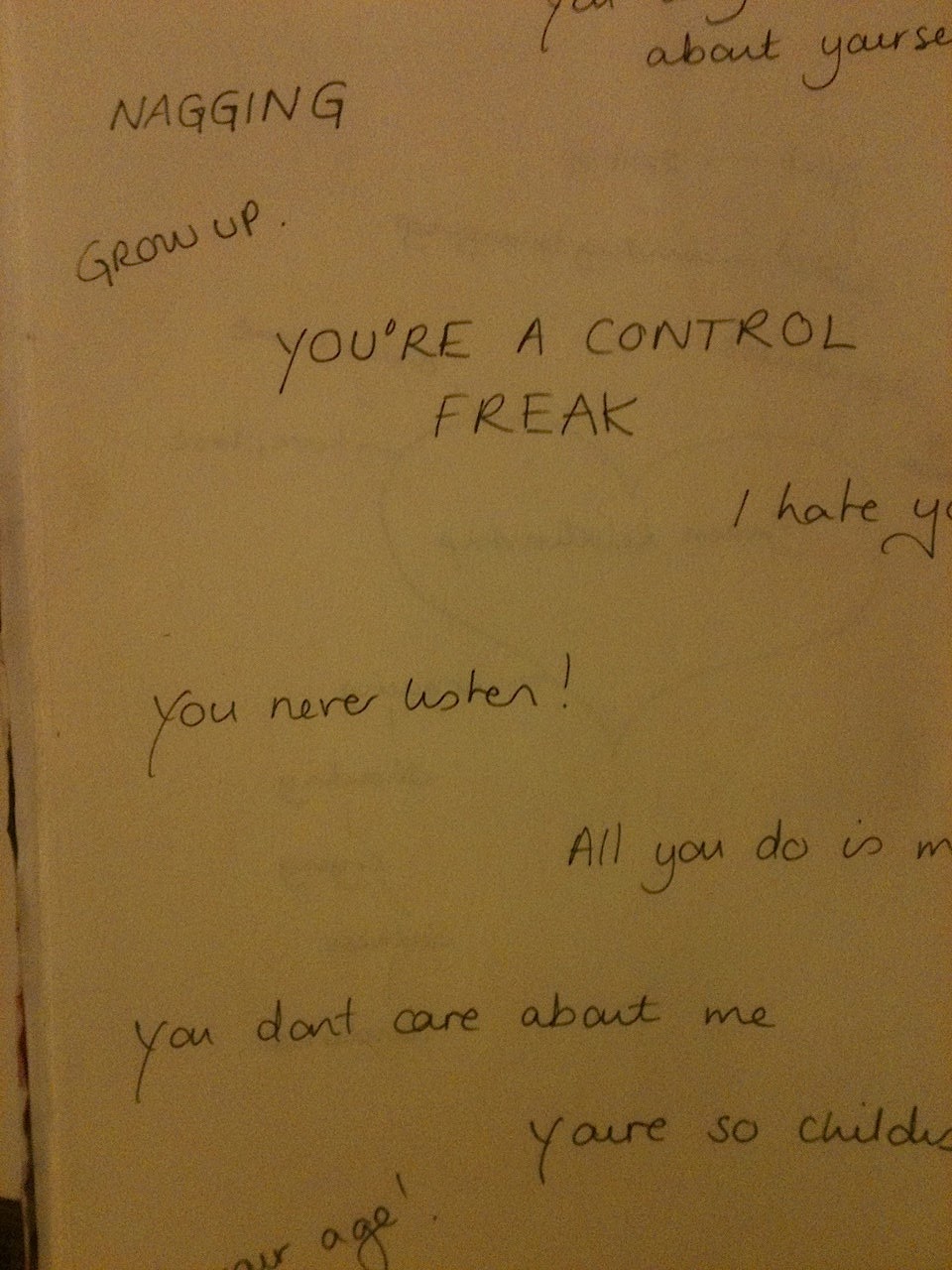
The final image. I think if this was worked on illustrator/photoshop with a decent font, it could work really well.
Tuesday 19 July 2011
Choosing content
After reading the section from.... the words that jumped out at me as 'keywords' were;
Large and empty
Middle aged man
Neutrality of surroundings
Spring sunshine turned bleak
Tall uncurtained windows
Large windows
Parallelogram of light/massive shaft of shadow
New Scotland Yard
Wartime London
Fixed contraction on brow
Burst of deepening anger
The first question posed to us was, if this passage of text were to be made into a film, what would the main character be like.
The first thing that came to mind, was the film and comic book character 'Marv, from 'Sin City' by Frank Miller.

'Marv' played by Micky Rourke in the film 'Sin City'.
The images are a little too 'hard' for the character from the text, but I like the darkness and moodiness of 'Marv', so these will be going onto my moodboard.
What furniture would have been in the office of a man working in New Scotland Yard in the 1940s. I found a photograph of a lovely Siemen's Bakelite telephone circa 1940.


pencil sketch of bakelite phone

I like the effect of changing the contrast on the scan. Perhaps using a sepia coloured paper would achieve this in the final illustration?

With 'Sin City' still in mind, I like the feeling that using red provokes. It feels angry and oppressive. Referencing Sin City again for its use of black and white with the use of occasional colours, usually red for its dramatic effect.
I ended up creating this image, using the book 'The 1940's look' for inspiration. I paid particular attention to the style of dress, and style of glasses available at the time. After completing the image, I realised I had wandered away from the brief, and depicted the scene being in the evening. I felt that a night sky was the only way that I could show 'wartime Britain'. I do think that if this had been a brief for a client, this may not have been acceptable. I found the subject difficult, as I had never drawn a man before, and kept drawing very feminine looking men! Overall, I'm happy, as I feel that my drawings are progressing.

Inspiration and learning
I went and spent some time today in the library, hoping to find some inspiration.
As I haven't been drawing/illustrating for very long, I feel that I need to develop my own 'style, and thought that if I found some artists work that I liked, it would help develop my own technique.
My favourite artists have always been Gustav Klimt, and Alphonse Mucha. Both from the same period in history (late 1800's- early 1900's), and my love for them has been their beautiful and almost ethereal depiction of women. Their work is neither perfect, or true to life, nor do I think they intended to be. That looseness and freedom in their work has both excited, and inspired me for several years.
Below are two pieces of artwork from the afore mentioned artists.

Alphonse Mucha

Gustav Klimt.
As I was already familiar with the work of these two artists, I began exploring the shelves to uncover those that I had heard of, but was not familiar with, or those that I hadn't heard of, but later realised their work was so popular I did in fact recognise it! I spent some time perusing the heavy-weights of the art world; Van Gogh, Botticelli, Matisse and so on. Despite finding many of the paintings impressive, there wasn't anything that I felt I could adopt in my own work. Later, I found a book about M.S.Escher, who I discovered is renown as one of the worlds greatest graphic artists (his work inspiring me to re-visit the exercise 'black and white). Escher lived between 1898-1972, and is most famous for his 'impossible' structures, such as 'Ascending and Descending, Relativity and his 'Transformation' prints.

ascending and descending
M.S.Escher
Apart from being a graphic artist, Escher also illustrated childrens books, postage stamps and murals. He worked with lithographs, engravings and woodcuts, as well as conventional drawing methods.

'Relativity'

1938 'Swallows and dragonflies'
What I like most about this last print comes from my background in fashion. I love the idea of creating a print that could be used as a piece of artwork, a wallpaper or most excitingly for me: for textiles.
Finally, I also loaned a book called 'Botanical Illustration Course with the Eden Project', by Rosie Martin and Meriel Thurstan. It is avaliable from Amazon for just £8 Botanical Illustration Course. It was also named Practical art book of the year 2008. I think it is a fantastic book, and I looked forward to referencing it when working on Assignment 2. There aren't lots of illustrations of fruit or vegetables, but the techniques discussed would work well or fruits, vegetables or flowers. There are a few illustrations of fruit which are just stunning. I really recommend this book!
Wednesday 13 July 2011
Using Black and White
We were asked to produce a line visual around one these four words: Sea, Extraordinary, Building or Journey.
I felt that 'Sea' would be the easiest topic for me, and as at present I lack technical skill, I went with this.
After some thought, I began thinking about a place that I spent a lot of time. I also had some recent photographs of sunsets over the sea that I thought would be nice to work with.
North Devon June 2011.


I then opted to change the images to black and white to make it easier for me to work from.


I messed around a bit with the contrast and brightness within photoshop to try and make the black and white stand out from eachother.
After producing my first line drawing, and first tonal, I felt that the image needed something more. Although there is no boat in the photograph, small fishing boats are strongly associated with Devon and Cornwall, so I went through my archive of photographs hoping to find some from Clovelly. I couldn't find a photograph so had to settle with some moats from Mylor Bridge near Falmouth, Cornwall.


Some illustrators work that I would describe as graphic.


both these images are by the illustrator Jasper Goodhall.


These three images are by Heath Robinson courtest of www.nocloo.com
Feedback on assignment 1.
I had some really helpful feedback from my tutor. Although the work I have so far produced has been disappointing to me, I didn't feel all was lost from my feedback!
What I have taken away, is that I haven't done any drawing, painting etc since I was a child. Yes, some people do have a 'natural' talent, many people develop their drawings/illustrations through practice, practice and more practice. With hindsight, I may have been better to start with a drawing course with OCA, but illustration was something that I had wanted to pursue, and had more interest in.
I was pleased to have to do an objective drawing, as whilst studying fashion, technical drawings were the only time I got to do any kind of drawing. I feel reasonably happy with the drawing of the 'Jimmy Choo' shoe, which has helped me to build a little confidence.
I do feel that there is some improvement to my work, and I hope by the end of the course I will have produced something that I am happy with. It's also a challenge not to try and compare myself to others, as when I do I see how far I have to go!
Onwards and upwards - rome wasn't built in a day!
I was encouraged to look at the following artists work; Gina Triplett, Jasper Goodhall, Bill Donovan and Paul Block.

Gina Triplett: Smokin' Mermaids
I really love this image, there is a lot going on, but the women remind me of 1950s and 60s comic books. They are very stylised, and the odd flash of colour really draws the eye to sections highlighted.
Gina Triplett is an American illustrator based in Philadelphia PA. Her work has been published in several anthologies including The Picture Book, and Illustration Now.

Jasper Goodhall
I wasn't quite as keen on the work of Jasper Goodhall, but I love the crisp clean lines in this image. The images are perhaps stronger than much of the illustrations I like. It's bold, strong and a little harsh. I like the monochrome featured in both his and Gina Tripletts designs, which also includes that splash of colour to catch the eye.
Jasper is a British illustrator, who is also a lecturer of illustration at Brighton University.

Bill Donovan
I absolutely love the work of Bill Donovan. His work is simplistic, soft, elegant, chic - everything that I love in an artist. I can't put into words how fabulous I think his designs are. I'm not the only one, with Donovan completing work for Christian Dior, Mercedes Benz, Estee Lauder to name just a few.

Paul Block
I love the fluidity and simplicity on Paul Blocks work. It does seem a little more dated than that of Bill Donovan. I also like the sketch like roughness, that still manages to create a finished looking image.
I've really enjoyed looking at the work of these illustrators, they have been very inspiring and exciting to me.
Monday 11 July 2011
a subjective drawing


Or alternatively, I wasn't sure if my representation of the lipstick looked 'bullet' like enough, so here is another image entitled 'ammunition'. (Which I stupidly spelt ammonition and then was unable to edit the text after i'd 'saved'. In my defence, I was thinking of the abbreviation 'ammo'!

Subscribe to:
Posts (Atom)